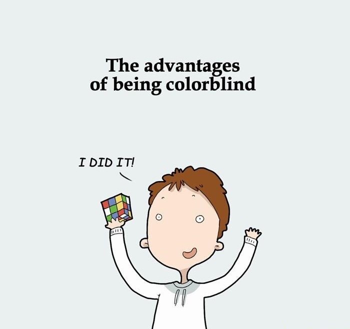
Do you know those teambuilding excerices where you have to tell a fun fact about yourself? Here’s mine:
I run a website dedicated to art and painting with over 1000 members. And I’m colorblind.
People are always shocked. “How can you do art when you don’t know the colors?” – “Isn’t this super hard for you?`” – “What color is this?” (while pointing at the sky).
Yes, not knowing what color things are can be hard when painting. Did you know that clouds are not always grey, but sometimes pink? Or that peanut butter isn’t green?
I have protanopia, which means that I have problems discriminating red and green hues. This influences not only these two colors but almost every other one as well. What even IS purple?
But like most things in life, if things get hard you just have to work smart. Here are my top 4 tips to create art as a colorblind person.
Contents
1. Can’ see color? Don’t use color!
What sounds like a dumb joke is actually my number one tip. There are many different ways to create art. You can vary your subjects as well as the painting media you are using.
On days where I really can’t be bothered to kepp asking my girlfriend questions like “Hey, what color is this plant? What color is this house? What color is your hair?” I simply drop everything colorful and stick to black and white.
A great painting medium that doesn’t use any color is pen and ink. It’s also pretty cheap to get into as all you need is some paper and a pen. Of course you can get more fancy equipment later.
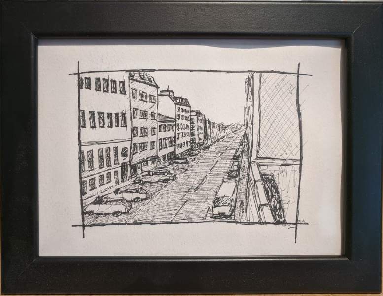
Pen and ink uses techniques such as cross hatching to create texture and depth. All colors are reduced to black, white and grey. And if you really want to add a single color it is guaranteed to make your drawing pop!
A fantastic resource for beginners with pen and ink is the YouTube channel of Alphono Dunn. Dunn ist a graduate of the New York Academy of Art, an award winning artist and a successful YouTuber with over 600 000 subscribers.
Once you’ve watched a few of Alphonso’s YouTube tutorials you’ve got a great base to create same nice looking basic drawings with pen and ink. Especially his series on Urban Sketching (basically going outside and drawing your city) is worth a watch.
A great way to learn pen and ink in a more structured way is Dunn’s book “Pen and Ink Drawing: A Simple Guide”. If you have a few bucks to spare I also recommend you to get the accompanying workbook.
2. The value in understanding value
If pen and ink isn’t really for you or you’ve already bought oils or acrylics this one is for you.
A lot of what makes a painting good has nothing to do with color hues but color values. In this context it basically means how light or dark a color is.
The color value of different objects tell you a lot about how far away they are and about their position relative to each other.
Of course things near a light source are often lighter in value than objects in the shadows. But did you know that there is an effect called athmospheric perspective? This is the effect the atmosphere has on the appearance of an object as it is viewed from a distance.
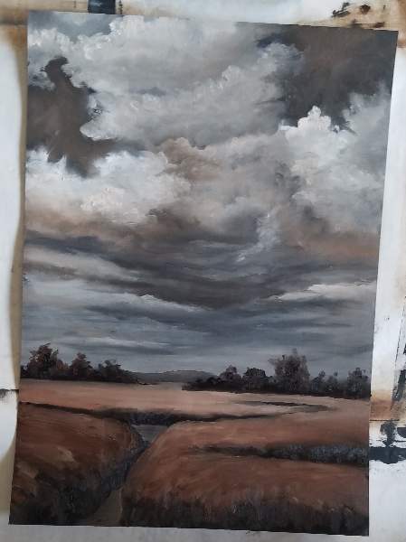
As the distance between an object and a viewer increases, the contrast between the object and its background decreases, and the contrast of any markings or details within the object also decreases. The colours of the object also become less saturated and shift towards the background colour.
Or in short: objects get lighter in value when they are far away.
A great way to get your feet wet (or snowy) is the ‘The Joy of Painting with Bob Ross’ episode ‘Shades of Grey’. Bob Ross recorded this one after meeting a colorblind person who told him that he could never paint. And boy, did Bob prove him wrong!

3. Stick to what you know, get help when you don’t
We know that the sky is blue. We know that grass is green. No problem choosing the right colors to paint these things.
All you have to do is check your paint tubes for the name of the color inside and youre good to go.
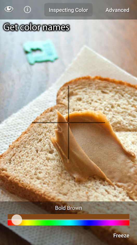
But what about the shirt in photo you are recreating in oils? Maybe some kind of green, yellow, orange or a color with a fancy name you don’t even know?
Technology is your friend. There are countless apps to help you get the name of the colors you can’t see. A great one I use is Color Blind Pal on Android. Simply open the app, point your camera and find out that the new shirt you just bought isn’t the color you thought it was. Great stuff!
Once you know which color you need to use you can either grab the right tube or check one of the numerous color mixing charts online to find out how to mix the hue you want.
4. Messed up? No problem
Painted a pink sky or orange grass by accident? No problem, just pretend you meant to do this from the very beginning. It’s art and if people don’t like it they just don’t get it 😉

Have any other tips for colorblind artists? Reach out on Twitter and let me know!